Anyone who uses a computer will sooner or later be faced with a graphics program and will have noticed the presence of some acronyms corresponding to color scales. You may not have wondered what they refer to, but you probably remember RGB or CMYK.
(1)
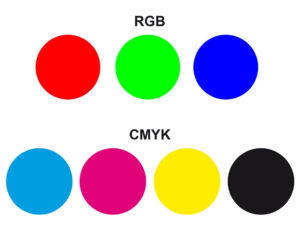
It should first be noted that the letters, in the composition of the two acronyms, are the initials of the colours constituting them. Red, green, blue for RGB and cyan, magenta, yellow, key black for CMYK(1). The second scale has a fourth color absent in the first, black. This is a completely normal aspect, since it is the chromatic scale that refers to the field of chemistry for the typographical reproduction of colour, where white is made up of paper and the inks used are transparent. This scale is commonly called four-colour printing.
(2)
Black, on the other hand, is absent in the RGB scale, which refers to the field of physics, therefore to colour as a luminous phenomenon, where black and white are not colours but the presence and absence of light. Moreover, if the colours in physics prove to be additives, that is, obtained by the sum of light, where the union of the three primaries gives the white, in chemistry they are subtractive, that is obtained by the subtraction of light, where the union of the three primaries, cyan, magenta and yellow give the black(2). The presence of black, called key colour in the four-colour printing process, is due to the transparency of the inks used in printing, where the black obtained by adding CMY does not appear full.
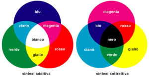
Picture 2 shows how in the RGB scale from the union of the primaries are the primaries of the CMY four-color process (cyan, magenta, yellow), while in the CMYK scale the union of the three CMY primaries leads back to the RGB primaries.
When we look at our computer screen, we see colour as a luminous phenomenon and therefore we see in RGB. The same thing happens when we watch TV. The colours we are observing do not actually exist, they are additionally composed in the transmission from our eyes to the brain. Pixels, present in our computers and televisions, are a set of light points of different colours that, placed side by side with each other, give us a chromatic illusion. The more light points there are in an image, the higher its definition and quality. This system of use of colour was already presented to us at the end of the 19th century by Seurat(3). He had deduced it from the studies conducted on optics by the French chemist Michel Eugène Chevreul (1786 – 1889), who had also gone to interview. His painting, made up of tiny touches of colour, gave rise to what we generally call Puntinism, which was to have wide repercussions throughout Europe, both in the work of his contemporary painters and in the production of subsequent painters.
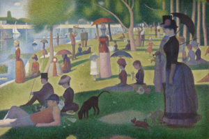
(3) George Seurat, A Sunday Afternoon on the Island of the Grande-Jatte, 1883-85
Our eye, as Luigina De Grandis reminds us in the wake of the theory of Young-Helmholtz (Thomas Young 1773-1829 and Hermann Von Helmoltz 1821-1894) (Luigina De Grandis, Teoria e uso del colore, Arnoldo Mondadori Editore, 1984), is equipped with three colour receptors. The first is more sensitive to short wavelengths and stimulated provides a blue-violet feeling, the second is more sensitive to medium waves and stimulated provides a green feeling, while the third more sensitive to long waves provides a feeling of red-orange. In essence, RGB corresponds to the response of our three color receptors. As mentioned above, this scale responds to colour as a luminous phenomenon and therefore to our way of perceiving it.
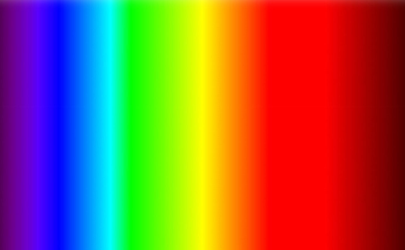
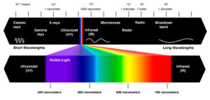
The optical apparatus allows us to perceive a small number of wavelengths (numerically variable from individual to individual), those approximately between 380 and 750 nm (nm is a nanometer that corresponds to one billionth of a meter). Where 380 marks the limit of violet light, followed by ultraviolet light and 750 the limit of red light, followed by infrared. This interval, between these two extremes, corresponds substantially to the frequencies between 668 and 484 THz (THz is a teraherz that corresponds to 1 000 000 000 Hz, where one hertz equals one pulse per second) and to the colour spectrum of the iris that Isaac Newton (1643-1727) obtained by refracting light using a prism, defining it as the visible spectrum, from the Latin spectrum, appearance. In fact, the perception of colour, as we know, is completely illusory. In physics, no object is colored, only the refraction of light on it gives us a given color sensation. A sweater appears orange because it reflects that given wavelength absorbing all the others, but that wavelength is actually colorless, it is our eyes and our brain that assign to that electromagnetic radiation the orange character.
(4)
The visible spectrum(4) is an infinitesimal part of the electromagnetic spectrum composed of other waves invisible to our eyes.
In the iris, the spectrum appears vertically, with red at the top and violet at the bottom, a phenomenon produced by optical diffusion due to the effect of white sunlight on the earth’s atmosphere. Higher frequencies, such as blue and violet, are better diffused by atmospheric molecules, which give the sky the typical colour we love so much. The red (620-750 nm and 400-484 THz), faster, tends to move away from our point of view, the blue (450-475 nm and 631-668 THz), slow, remains at the bottom. Wavelength and frequency are inverse, the higher the frequency the shorter the wavelength and vice versa.
A source of light that comes close to our point of view becomes blue, moving away mute in red. It is this principle of the red shift (Batocromo – Redshift effect) that allowed Edwin Hubble (1889-1953) in 1929 (although with the precedents of Vesto Slipher who in 1912 measured the first red shift and Alexander Friedman, who, through the homonymous equations, showed how the universe was expanding, in contrast to the static universe theorized by Einstein) to confirm the accuracy of the big bang theory. Observing the shift from blue to red of the light bodies in the universe, they understood that they were moving away, demonstrating that the shift due to the initial explosion of the big bang is still in progress. Subsequent theories supported Hubble’s hypothesis.
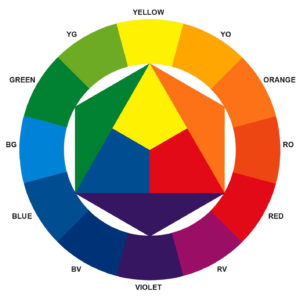
Two considerations must be made which seem essential to us. The first concerns the choice of colours proposed by Newton for the composition of the visual spectrum (violet, indigo, blue, green, yellow, orange and red). A choice suggested by symbolic-esoteric reasons that led him to determine it in seven parts, such as the days of the week and the musical notes. It led him to a series of rather arbitrary conclusions that Goethe and Hegel already contested him. It should also be noted that Newton originally divided the spectrum into only five colors (red, yellow, green, blue and violet) and, which only later became seven for the symbolic reasons indicated. Looking at the spectrum we immediately realize that the colors do not correspond to seven, but it contains a series of shades that make them numerically superior. Indigo, for example, is difficult to perceive and tends to blend in with blue and violet, while the cyan that Newton does not consider is clearly visible. Brown or magenta, or derivatives of red and violet lightened by white, do not appear. Contrary to what is believed, the spectrum does not include all the colours that we can distinguish. The second consideration concerns the primary colours, which in the case of the RGB scale (luminous-physical phenomenon) are undoubtedly derived on the basis of the spectrum. While for the CMYK scale (typographic – chemical reproducibility) we cannot say the same, as we have just noticed, magenta is absent from the spectrum, it is instead the result of the overlapping of the blue and green wavelengths of the RGB scale. If we take into consideration the primary colours suggested by Johannes Itten (1888-1967) in his chromatic disc(5): blue, red and yellow, they certainly seem derived from Newton’s visible spectrum. These are the ones we will deal with here. The scholar, in fact, developed his theory (Johannes Itten, Art of Colour, Il Saggiatore, 1982) with reference to the artistic expression of visual texts.
The stimulation of our visual and psychic apparatus by the wavelengths generates in us physiological sensations, for this reason we associate colors with symbolic characters and meanings, aspects, which perceptual psychology has long dealt with and which we will deal with more. For further information on the scientific aspects you can refer to the numerous manuals on the theory of colour on the market.
(5)
Itten places in the central triangle the three primary colours, from the combination of which all the others are generated, but which cannot be obtained by mixing other colours. The primary colours are therefore pure by definition, possessing a degree of saturation of 100%, where saturation is a quality of colour that indicates the type of colour (red, green, orange, blue, etc.). The purity or saturation indicates the intensity and the chromatic concentration, it is therefore saturated a color that does not tend to gray, not contaminated by white or black that would determine a lightness or darkness of the shade. Summarizing: tint = type of colour; tone = quantity of light present in a colour, which determines it as light or dark, according to the presence of white or black in it; saturation = degree of purity of the colour, which changes with the addition of white, black or other colours, determining a contamination that modifies its brilliance.
Itten therefore places red and blue at the base of the triangle and yellow at the vertex.
The red among the perceivable light radiations has the longest wavelength (620-750 nm) and the perceptive impression that we receive is that it advances.
It is good to remember that in art and in physics chromatic advancement and retreat are exactly the opposite, if in art red is the colour that advances most and blue the one that retreats most, in physics the situation is specular, as already observed in the red shift for Hubble’s theory. This apparent distance, between the two disciplines, can be traced back to the longer wavelength of red, which takes it into deep space with respect to the earth, precisely because it is faster, it is therefore advancing, the same speed that makes it advance in art and in perceptual phenomena in general.
Obviously, we will deal with the aspects of advancement and chromatic retreat from the artistic point of view.
The red, therefore, seems to advance, in its presence heartbeat and adrenaline increase, for this reason we usually associate it with love, passion, but also with violence and aggression. All situations in which our heart rate accelerates and adrenaline production increases. The physiological stimuli of the colours influence our way of thinking, an aspect that reverberates in some of our ways of saying: “I have seen red” says those who are angry. This avant-garde and aggressive character of red makes it ideal for road signs of danger(6) or for the immediate identification of street furniture of social use, such as mailboxes. Let’s not forget that red is our blood.

(6)
Of the three primary colours, red stands out as the warmest, as opposed to blue as the coldest. Itten has, in fact, placed them in opposition to the base of the triangle, assigning blue to the left and red to the right. As Arnheim explained to us in 1954 (Rudolf Arnheim, Art and Visual Perception, Feltrinelli, 2002), the same subject, with equal form, mass and colour if placed on the right, appears illusorily larger. For this reason, what is on the right is more easily remembered. A deception that comes from our perceptual orientation of reading from left to right, for which what travels in the opposite direction, that is, arriving at us from the right, arouses our attention and curiosity. Thus, in theatre, characters not fundamental for narrative purposes enter the scene from the left, while relevant characters enter from the right, The placement of blue and red therefore respects the two different chromatic characters.
Blue (450-475 nm) has a much shorter wavelength than red (only indigo and violet are shorter than blue) and seems to be receding. In its presence our body relaxes and our heart decelerates, we associate it with calm and serenity. For this reason it is so much loved in advertising by the banking, insurance and similar identities.
The relaxing aspect of the blue makes it ideal for furnishing the room of our children, in which we hope they rest peacefully. The aspects of comfort and security make it perfect for the uniforms of law enforcement agencies in various countries. His calm reminds us of spirituality, we must not forget that blue is the sky. Itten places it on the left, where it brings no surprise and where we expect to find it, in harmony with the aspects of quiet and order that characterizes it.
Yellow (570-590 nm) has a wavelength that is almost half of the visual spectrum (at the exact center is green), so it is an active color, but not impetuous, which is characterized by its brightness. With the exception of white, which is not a colour but light, yellow is the brightest colour on the chromatic disc. It radiates light and heat, it is the sun and we are driven to associate it with wisdom and enlightenment in a cultural and spiritual sense. “It is an enlightened person”, “it is a brilliant man or woman”, ways of saying that demonstrate our way of understanding light and chromatic brightness. The haloes of the saints are yellow or golden, they belong to the world of light and are omniscient. Itten places him at the top of the triangle, as an interpretation of improvement, mental and spiritual ascent, research. Someone is told to be “clear”, because where there is light there is no subterfuge or deception. For these reasons, non-pure yellow can take on negative meanings, suggesting acidity or disease. Its barely altered brightness appears contaminated and polluted.
The three primary colours, if united two by two, form as many secondary colours; to speak of secondary colours, therefore, means to speak of the character union of the primary colours.
If we mix red with blue, we combine the maximum of cold and heat, advancement and retreat, impetuosity and serenity. Let’s unite the two opposites par excellence and obtain the violet (430-450 nm). A colour that distinguishes border areas such as occultism, which is poised between life and death, magic, which is poised between real and unreal, or mysticism, which is poised between the earth and the otherworld.
It is good to make a specification, here I am referring to the violet composed of 50% blue and red, which in Itten’s record (figure 5) is under the blue and red and which looks much more like the indigo of Newton’s visible spectrum than the violet. We consider this violet pure and balanced, if we add more percentages of blue or red we move towards the cold or warm pole of this shade, obviously changing its perceptive and psychological aspect we change its character and symbolism. The violet with a higher percentage of red is activated, acquires brightness and vitality, with a higher percentage of blue retreats, becomes deep tending to stasis. The latter leads to meditation and calm, the first is ardent and suggests feminine sensuality.
From the union of red and yellow, brightness plus heat, advancement plus irradiation, irruence plus research, we get the orange (590-620 nm), the maximum energy, youth, where heat and light are at the brilliance and where irruence meets the search for themselves. The light that meets fire, the balance between spirit and libido that, as known, has an unstable nature. It is therefore obvious that the orange with a higher percentage of red slips towards lust, while, with a greater presence of yellow, tends to spirituality: the clothes of the Buddhist monks are yellow saffron and orange.
From the union of blue and yellow, cold added to light, retreat to radiation, serenity to evolution, we obtain the green (495-570 nm). After blue it is the most restful colour, for us it is nature and if we observe its evolution in it we understand its values better. In the spring, the greenening of the trees gives the leaves, at the beginning of the season, an almost yellow colour, but tending to green. Approaching the summer season, the green becomes intense, until it becomes, in late summer now approaching its end, a deep green rich in blue. From light to darkness, from life to death. This experience accompanies us from an early age and is powerfully deposited in our unconscious. Green, with a higher percentage of yellow, is inextricably linked to the natural world and organic food. While, the aquamarine green, is widely used for packaging in pharmaceuticals and in health care in general.
Obviously, the shades of transition from one shade to another are many and it would be foolish to list them here. We are interested in pointing out that these colours of passage, which Itten places in the outer circle, which also shows the secondary ones, are called tertiary colours.
The Swiss scholar has organized his disc so that the complementary of each color is immediately identifiable, he puts it in a position opposite to the color of which it is complementary: red is opposite to green, blue opposite to orange, yellow opposite to purple, yellow-green opposite to red-violet, blue-green opposite to red-orange and so on.
The complementary colours, if mixed together, lead back to the balance given by the sum of the three primaries, which in additive synthesis is white and in the subtractive one black. For example, blue + orange (red + yellow), again proposes the union of the three primaries, the same applies to the others of course. The complementary of a colour therefore brings it back to its initial equilibrium and if approached they find themselves in harmonic agreement.
Bibliografphy
ARNHEIM Rudolf, Arte e percezione visiva, [1954], Milano, Feltrinelli, 2002.
BARONI Daniele, Il manuale del design grafico, [1999], Milano, Longanesi & C., 2006.
CHEVALIER Alain GHEERBRANT Alain, Dizionario dei simboli, [1969], Milano, Rizzoli, 2006.
DE GRANDIS Luigina, Teoria e uso del colore, Milano, Arnoldo Mondadori Editore, 1984
ITTEN Jhoannes, Arte del colore, [1961], Milano, Il Saggiatore, 2001.
KANDINSKY Wassily, Punto linea superficie, [1925], Milano, Adelphi, 1982
PRIGOGINE Ilya, Le leggi del caos, Bari, Laterza, 1993.
SWEENEY Michael S., Dentro la Mente – La sorprendente scienza che spiega come vediamo, cosa pensiamo e chi siamo,, Vercelli, Edizioni White Star (per l’Italia), National Geographic Society, 2012
TORNAGHI Elena, Il linguaggio dell’arte, [1996], Torino, Loescher, 2001
Siti web