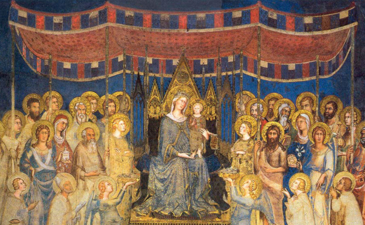
Simone Martini, Maestà (detail), 1312-15
To give an example of the rhythmic use of colour, we will talk about the famous Maestà (1) by Simone Martini painted in 1312-15.
(1)
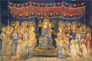
The work has a horizontal course. In the lower part there is the throne on which sits the Madonna and Child and on whose sides are gathered the saints, above them, in the upper part, stands out on the blue background the colored canopy that serves as a cover. If we now try to eliminate the upper part of the painting (2) what happens?
(2)
The image seems much less effective, flatter and more static. The strength of the work is, in fact, all assigned to the decoration, whose red and black-gold alternations create rhythm and movement, being also placed in a ups and downs that accompanies the succession of rhythmic-chromatic seem to rotate the whole scene like a country carousel, of which it seems to us, observing it, to feel the music of a music box. The same figures without it appear more separate, it is the rhythmicity of the decoration that makes them dialogue.
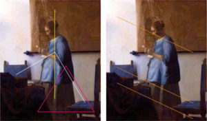
The colour used rhythmically gives harmony – which, as in the vocabulary, is the consonance of voices or instruments; a combination of chords, i.e. simultaneous sounds, which produces a pleasant impression on the ear and soul (www.treccani.it) – to the work. The harmonic presence of colour is usually used in the construction of an image. Colours present in the characters, for example, can return to some elements of the landscape, to create assonances that give continuity and rhythm to the image. If we look at Woman in Blue (3) by Johannes Vermeer (1632-1675), for example, we can see how the use of blue returns in the figure and in the two chairs, one placed in front and the other in back. This return of blue gives continuity and makes the figure much less static, which being placed in the vertical center would risk assigning to the entire work a rigid immobility. The two chairs in harmony with the woman’s dress give harmonic continuity to the image. The skirt recalls, again by chromatic assonance, the map hanging on the wall, creating vertical continuity between the top and the bottom. Finally, the assonance created by the shadows of the tablecloth in the foreground, of the side of the chair always in the foreground and of the dress, forms a central triangle whose vertex indicates the woman’s dress.
(3)
Then there is a spatial trend, diagonally descending, generated by the light of a window that we do not see and that rests on the face of the woman, a diagonal descent replicated by the blue of the two chairs and the shadows of the elements placed in the foreground. On the one hand we therefore have an assonance of colours that assigns harmony and rhythmic reading to the work, on the other hand we have a directionality that assigns a spatial and content-based trend to the image. In fact, the diagonal descending line does not suggest anything positive about the content of that letter. Does the map remind us that the letter comes from distant lands? Where is her husband, given that she is pregnant? Written by him or simply bringing news of it? The fact that realistically the woman portrayed, as in many other paintings by the Dutch master, is his wife, did not prevent Veermer from employing his model to stage narratives unrelated to his family life.
Let’s now take an advertising example in which the sales message is mainly assigned to the chromatic aspect (4).
The page advertises a well-known liqueur, of which it does not indicate its specific qualities, but instead associates it with friendship, that is, it leverages on our concept of belonging and union. Aspects that make us feel safe and warm, so to speak. Both the headline, “add flavour to an evening with friends”, and the image arouse warmth and belonging. The three friends, who smile confidentially, appear on the bottle of liquor, where, above their heads, the same headline appears, associating immediately with the three figures and at the same time highlighting them. The bottle has a very warm color, that of the liqueur, used to contain and represent the complicity of those looks and those smiles. The colour appears all the warmer in relation to the blues and purples of the background, which, they seem to suggest, only by drinking Grand Marnier does one belong to a group of friends, outside of whom the cold and loneliness reign. Bottle and glasses, by rhythmic-chromatic association, proceed diagonally upward, a trend replicated by the headline and the logo related by the white. This double rhythmic-chromatic ascent composes a visual corridor of perspective nature, which pushes the bottle, and friends, in front of us, coming from a distant horizon on the right up to the first floor on the left. A device that makes the presence of the bottle and the group of friends inside it even more effective, as they seem to meet us and invite us to belong to that exclusive circle.
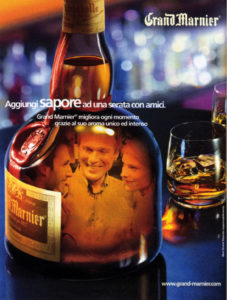
(4)
Bibliography
ARNHEIM Rudolf, Arte e percezione visiva, [1954], Milano, Feltrinelli, 2002.
BAIRATI Eleonora – FINOCCHI Anna, Arte in Italia, [1984], Torino, Loescher Editore, 1991.
BARONI Daniele, Il manuale del design grafico, [1999], Milano, Longanesi & C., 2006.
CHEVALIER Alain GHEERBRANT Alain, Dizionario dei simboli, [1969], Milano, Rizzoli, 2006.
DE GRANDIS Luigina, Teoria e uso del colore, Milano, Arnoldo Mondadori Editore, 1984
DE VECCHI Pierluigi CERCHIARI Elda, Arte nel tempo, [1991], Milano, Bompiani, 1996.
GOMBRICH, Ernst H. HOCHBERG Julian BLACK Max, Arte percezione e realtà, [1972], Torino, Einaudi, 2002.
ITTEN Jhoannes, Arte del colore, [1961], Milano, Il Saggiatore, 2001.
KANDINSKY Wassily, Punto linea superficie, [1925], Milano, Adelphi, 1982
MALTESE Corrado, Guida allo studio della storia dell’arte, [1975], Milano, Mursia, 1988.
SPIZZOTIN Pierantonio a cura di, Il Quattrocento in Europa, in I secoli d’oro dell’arte, Milano, Orsa Maggiore Editrice, 1988
SWEENEY Michael S., Dentro la Mente – La sorprendente scienza che spiega come vediamo, cosa pensiamo e chi siamo, Vercelli, Edizioni White Star (per l’Italia), National Geographic Society, 2012
TORNAGHI Elena, Il linguaggio dell’arte, [1996], Torino, Loescher, 2001
VALLIER Dora, L’arte astratta, Milano, Garzanti, 1984.
WORRINGER Wilhelm, Astrazione e empatia, [1908], Torino, Einaudi, 1975.
Website