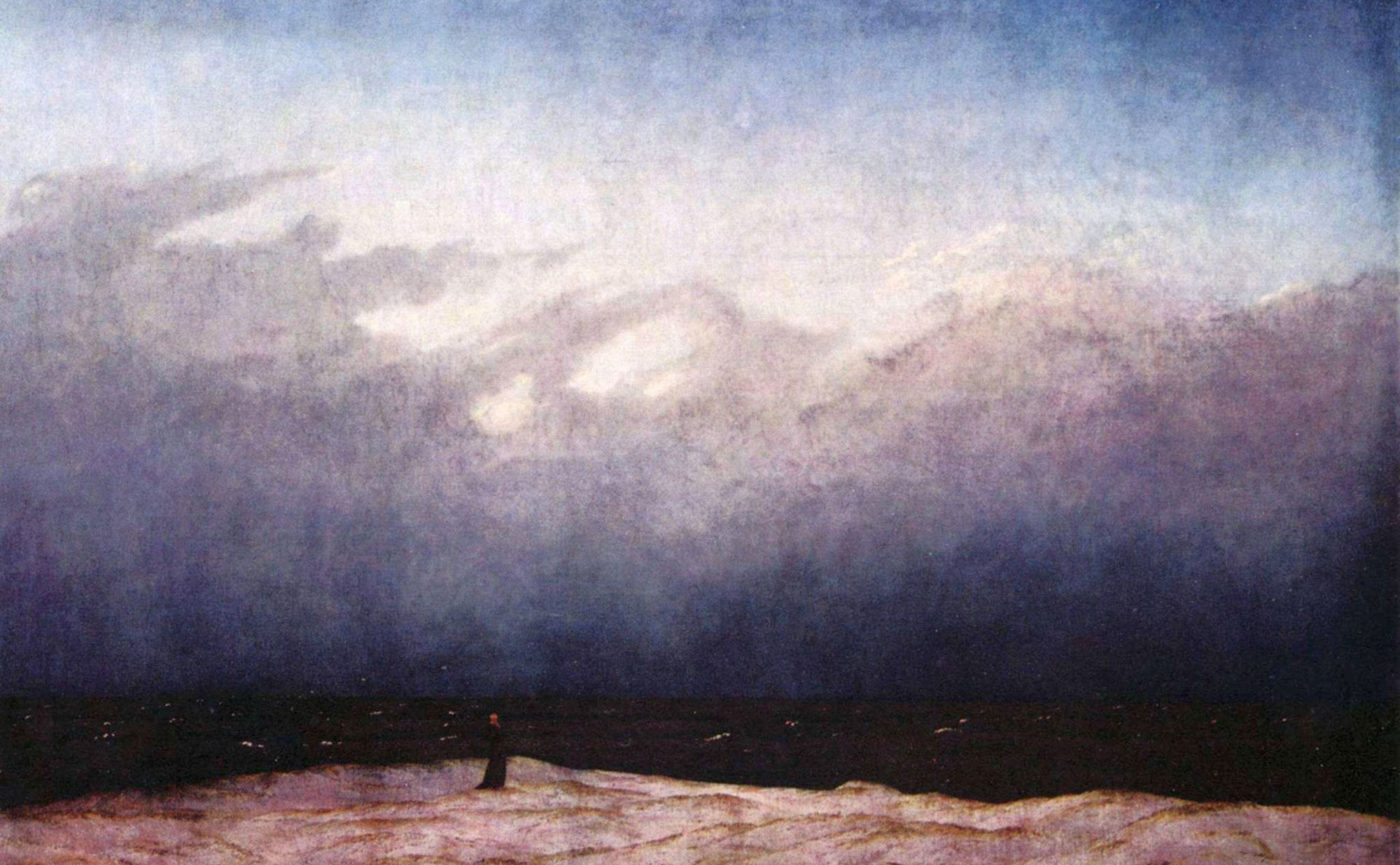
Caspar David Friedrich, Der Mönch am Meer, 1808-09
If the composition concerns the course of an image (horizontal, vertical, diagonal ascending / descending), the framing determines the point of view that the author has assigned to the viewer’s gaze, demonstrating that the image is designed specifically for him, for his involvement. The choice of the framing is therefore essential for the conveyance of the message, being able to place the viewer in a dominant or inferior position, protagonist or external.
Let’s give you some examples of its use in the advertising area.
The following three images present a shot from below, more or less pushed.

The most forced is certainly the third of the Roma Uomo perfume. The bottle, placed on a stone base, reproduces the colonnade of a Roman temple and the view from below monumentalizes it presenting it as a true temple. The central verticality of the composition echoes the monumental solidity and firmness.
In the first image the bottom view of the bag is less forced, but it occupies almost the entire width of the page, also in the background we see a landscape with a very low horizon, tending to increase the vertical thrust of the bag. All the elements suggest that this bag has undoubted capacity to hold, being proposed to us as a travel bag with the monumental size of a building.
The barely hinted view of three quarters of the bag, in the central image with the washing machine becomes overbearing. In many cases, the advertising pages proposing washing machines or family cars show us the object from below and seen by three quarters, the containing aspect being the main selling characteristic of both products. In this example, compared to a traditional advertising image for washing machines, the iconographic and textual reference to the fairy tale of Little Red Riding Hood is used, a way to make us smile while telling us that the washing machine has great capacity for containment. “What a big mouth you have” says the headline, while from the porthole of the appliance comes out a red cape, in front of which is placed the basket to be delivered to grandmother. This reminiscence, inherent in all of us, is a Trojan horse to present something traditional in an unconventional and ironic way, tearing out a smile and making us accomplices of the message.
The use of a “Trojan horse”, i.e. a pre-existing image in our imagination, is widespread in advertising. In fact, it cannot take into account the attention of the viewer – as happens in the case of the arts to which we access on our own initiative – and therefore has to deliver the advertising message in an infinitesimal amount of time. Building the promotional message through an idea already present in the viewer’s memory is therefore a formidable tool.

The framing from below, in this illustration by Chris Garbutt, involves us in first person, putting us in a subjective position. We are the child the bully is waiting for. His posture and grim gaze announce a bitter destiny, made of harassment. Perhaps he will force us to pay with a pledge with one of the cans or snacks contained in the dispenser, to which he firmly rests his arm to block the road, while the legs fold forming an x on the door at the end of the corridor, a sign that the way is closed to us and that that door is unreachable for us.
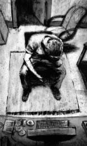
In Chriss Koelle’s illustration we find an inverse frame, in this case we are assigned a role of observers, placing our eye above the room and the character represented.
The scene is dramatic, within the environment, intimate and familiar, the man is shown crushed down, defeated, won by events, his resting his forehead against the palm of his hand confirms it. The use of the nervous and dirty tract interprets and declares the drama of the event itself, revealing that life is a dirty matter.
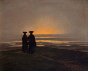
If we examine one of Caspar David Friedrich’s paintings, such as The Sunset of 1830-35, we have the opportunity to observe some peculiarities of its representation. The figures seen from behind, the wide horizons shown with a “long shot” and often dominated by sunsets or dawns, are three aspects that Friedrich particularly loves and that are inextricably linked to his poetics.
Of these characteristic aspects, long fields are certainly an indispensable constant. The depiction of these distant horizons allows the painter to give a broad breath to the work, to show the vastness and power of nature. So when the human figure introduces us, according to the size assigned to it, it tends to stand out or get lost in that vastness, to scrutinize the infinite distances or to succumb to the immense. The figures seen from behind take on a symbolic value not being able to recognize the identity, those men and women represent each of us, therefore, Friedrich, places the viewer heroically (according to the canons of Romanticism) in front of the powers and the natural vastness. We are called to face and investigate them in order to arrive at something new (dawn). Or lose ourselves defeated in them (the sunset). Certainly we are spectators of the natural majesty, whose luminescence seems to refer to the divine rather than to the atmospheric. In this sense, his work is perfectly referable to the romantic climate and to that concept of sublime, so in vogue at the time and that Kant defines as “a mixed feeling of dismay and pleasure that is determined by the absolutely great and immeasurable”.
These few examples, while not being able to exhaust the possibilities of use, give us an idea of the expressive capacity of the framing. Comics and illustration make greater use of framing than painting. Painting, in fact, is much less dynamic, not using time sequences, everything that narrates organizes it in a single space, giving rise to a long story, where the compositional aspect becomes fundamental. Comics, as a sequential art together with cinema, uses framing for its natural vocation. From the very beginning, dating back to 1895, these two twin arts have exchanged and stolen ideas in the implementation of the sequential story, changing and coming down to us in the form that is known to us and in a process of transformation still in progress. Illustration, according to the inclination of the authors, can be more dynamic or more static, but it can certainly not forget that it expresses itself with an image at a time, an aspect that brings it closer to painting. Although conscious, in the case of the illustrated book, that having more than one image available can organise the narration in the light of this, where each image, while speaking for itself, remains in dialogue with the others.
Bibliografphy
AA.VV., Desideri in fiorma di nuvole. Cinema e fumetto, Paisan di Prato (UD), Campanotto Editore, 1996.
ARNHEIM Rudolf, Arte e percezione visiva, [1954], Milano, Feltrinelli, 2002.
BARBIERI Daniele, I linguaggi del fumetto, Milano, Bompiani, 1991.
BARONI Daniele, Il manuale del design grafico, [1999], Milano, Longanesi & C., 2006.
DE GRANDIS Luigina, Teoria e uso del colore, Milano, Arnoldo Mondadori Editore, 1984
DE VECCHI Pierluigi CERCHIARI Elda, Arte nel tempo, [1991], Milano, Bompiani, 1996.
FAETI Antonio, Guardare le figure, [1972], Roma, Donzelli Editore, 2011.
GOMBRICH, Ernst H. HOCHBERG Julian BLACK Max, Arte percezione e realtà, [1972], Torino, Einaudi, 2002.
ITTEN Jhoannes, Arte del colore, [1961], Milano, Il Saggiatore, 2001.
KANDINSKY Wassily, Punto linea superficie, [1925], Milano, Adelphi, 1982
SWEENEY Michael S., Dentro la Mente – La sorprendente scienza che spiega come vediamo, cosa pensiamo e chi siamo,, Vercelli, Edizioni White Star (per l’Italia), National Geographic Society, 2012
TORNAGHI Elena, Il linguaggio dell’arte, [1996], Torino, Loescher, 2001
Websites