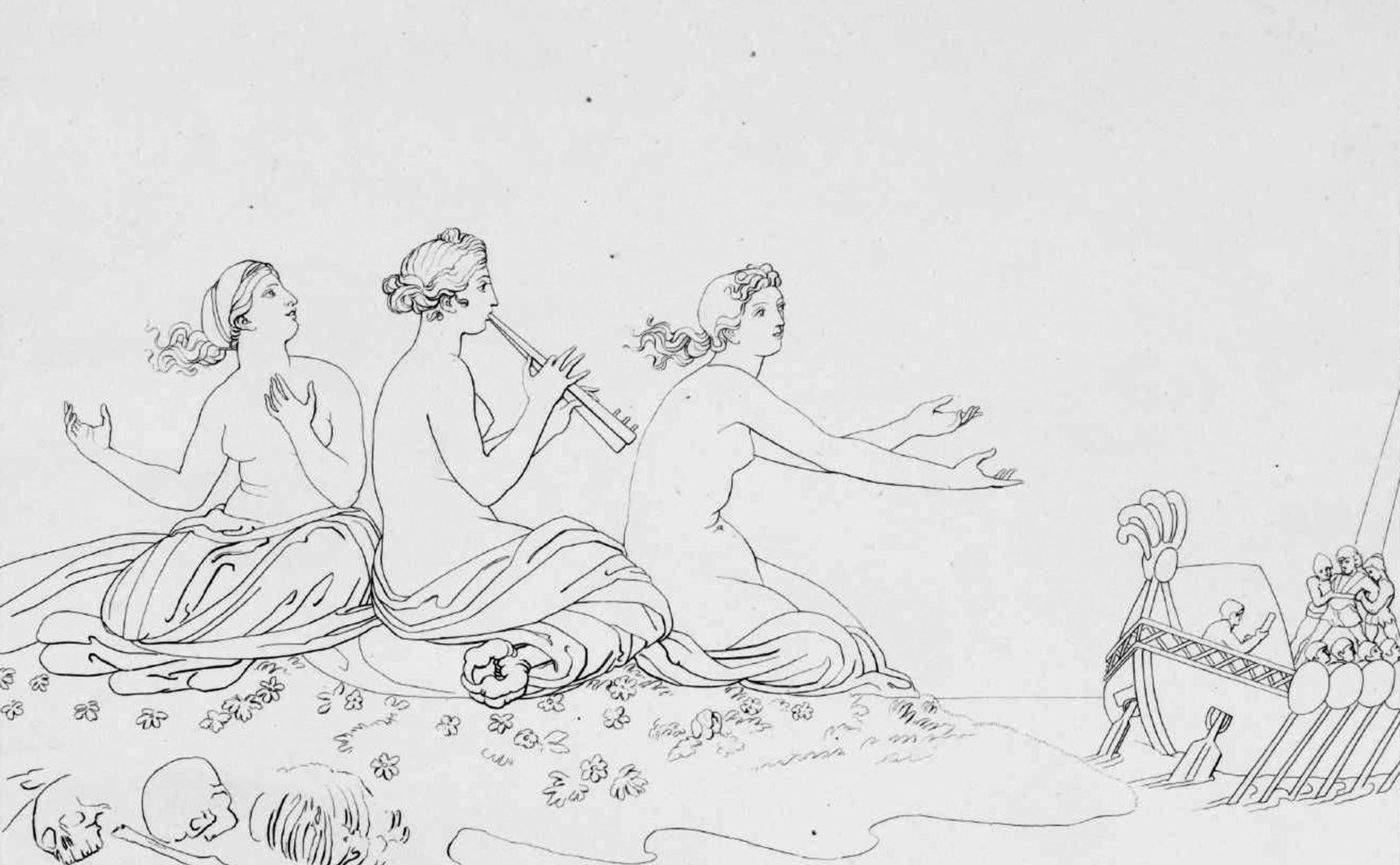
after John Flaxman, The Sirens, 1805, Tate Modern, London
What has always struck me about the representations of Moebius (Jean Giraud 1938-2012) ¬ – even though he is an author dedicated to comics and therefore to an art form that is by nature dynamic and sequential – are the metaphysical sensations and suspension that emanate from them. This is an aspect that is not obvious and, in some ways, surprising that characterizes the work of one of the greatest interpreters of this applied art.
The line and the stroke constitute the alphabet of its language, a typical aspect of the Franco-Belgian area where the tradition of the ligne claire developed. Although, it must be said, with neoclassical and eighteenth-century precedents, as in the engraving by the Englishman Jhon Flaxmann (1755-1826), within which the line no longer responds to the traditional canons of chiaroscuro, to become instead synthetic in the rigorous definition of the contours of the subjects or where, more broken, form traits that suggest an environmental spatiality of places that in fact are not represented. This is certainly not a surprising aspect, given that Flaxmann’s engraving work is mainly used to illustrate great classics, the Odyssey and the Divine Comedy, to name but two.
His work as an engraver, together with that of many other artists of the Enlightenment period, marked the starting point of that illustration devoted to narrative, which would continue throughout the nineteenth century, outlining the character of modern illustration through the publication of an exorbitant number of periodicals and novels of the genre throughout Europe (Paris and London, the two driving forces of the so-called Contemporary Era marked by the advent of the bourgeoisie, were particularly important in this regard, which, thanks to the first industrial revolution, developed its economic power, thus giving life to capitalism on the one hand and to “popular” culture on the other, and which in the genre novel saw one of its most important manifestations, accompanied by increasingly widespread literacy that made possible the birth of the publishing industry and the phenomenon of best sellers, among which, one of the first in Italy, was the classic school book I promessi Sposi by Alessandro Manzoni, the various editions of which were accompanied by illustrations). It was on the pages of those periodicals and novels that illustration took on a linguistic character that was increasingly detached from the examples of “cultured painting”, until it gave shape to comics at the end of the nineteenth century (1896). Popular prints were also to represent an important aspect of the then nascent publishing industry, constituting a product for the diffusion of that new language of representation which today seems so normal and obvious to us because it was part of our imagery. A clear testimony of Flaxman’s legacy, we can find it in a large part of today’s, and not only, illustration dedicated to the dissemination of the Hellenic epic in children’s publishing and in particular in the black and white illustration that accompanies the internal pages of those texts.
As I said, line and traict constitute the Moebuisian alphabet, an alphabet of which I am going to make an analysis through a single image taken from 40 Days dans le Désert B(1), which aims to account for his stylistic language and his intelligence and refinement as an author, as well as those characteristics of temporal suspension that are typical of him. Even in the great French cartoonist there is on the one hand the use of a synthetic and rigorous line that surrounds the subjects, a unique line that does not produce a three-dimensionality (for the grammatical aspects of the line I refer to my previous speech https://www.danilosantinelli.it/danilos-blog/line-gesture-and-matter/), and, on the other hand, the use of a short and fragmented line aimed at making spatiality and materiality of the environment and surfaces. He too, therefore, adopts a double register of the line: a continuous and concluded line that outlines animated and inanimate subjects; a line that fragments and responds to a double need, material mimesis and spatial mimesis. As in Flaxman, here too, the space actually represented is small, essentially made up of the ground that ends in a very low horizon line and on which the archer sits. The remaining empty space can only be the sky, even though there are no elements that refer to clouds, sun or birds.
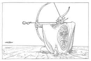
Although the horizon is very low, the use of that fragmented line by Mebius makes us perceive an enormous space, which seems to continue as far as the eye can see. As we expect it to be a desert. Those few stretches, broken to the point of being reduced to dots, are an unequivocal spatial dilation in our eyes. Just as that continuous and univocal line assigns a solid, almost sculptural, firmness to the archer (it should be remembered that John Flaxman was a sculptor and that the lines he uses in his engravings to outline the subjects also make them appear as if they were sculpted). The capacity for synthesis and intelligence that Moebius already demonstrates here is extraordinary, but there is much more. That statuesque firmness is not in fact generated only by the use of the contour line, but even earlier and with greater force by the compositional elements, which, although not visible, are present and constitute a fundamental aspect of the image we are going to demonstrate.
We introduce, inside the rectangular space of the image of Moebius, a square coinciding with the vertical border on the left and we observe what happens.
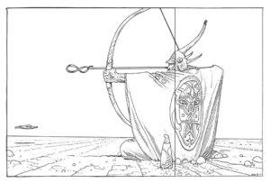
Surprisingly, the vertical right edge of the square coincides with the opening of the helmet that shows the face of the archer, also coinciding with the strange object placed on the ground at his side. And if we now trace the median vertical of the square, what do we discover?
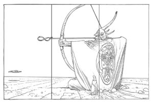
The rectangle is equally tripartite and the median vertical of the square coincides with the base of the tip of the arrow which, however, is not an arrow and soon we will see the reason. This tripartition of the square on the one hand emphasizes compositionally the salient points of the event represented: the face of the archer whose gaze, through the rod of the arrow, is turned to the tip of the arrow-not arrow; the tip of the arrow that, precisely because it is not an arrow, plays a key role given its shape. On the other hand, the same regular tripartition makes everything appear very stable, precisely because there are no imbalances and everything is assigned an equivalent position. Also the perfect arm-arrow parallelism, absolutely horizontal, contributes to this stable regularity. As well as the cut, in the upper edge of the image, of the curvature of the arch that blocks its stroke, being the only curved and diagonal dynamic element that could break the immobile regularity of the scene.
That arrow does not end, as one would expect, with a common arrowhead, but with the symbol of infinity, a metaphor for an uninterrupted temporal cycle. Those broken traits, to the point of becoming dust, do not therefore suggest a single spatial dilation, but also a temporal dilation. That stability, dictated by the univocal and concluded line that solidifies the figure of the archer in a statuesque pose, carries out at the same time a temporal solidification marked by the perfect spatial-temporal tripartition of the composition, which replicates that cyclicality just described and summarized by the arrow-infinite. If this were not enough, the suspension, suggested so far, explodes in all its evidence in the strange stone still and suspended at the left edge of the scene. Immobility witnessed by the perfectly stable shadow that it projects to the ground. A temporal suspension that finds new assonance in the object next to the archer and in the decoration placed on his garment that have an undoubted magical-esoteric flavor, referring to the otherworldly and the spiritual that in the cyclical stability of supernatural events takes place, or, at least, that we attribute to them.
The archer faces left and the arrow in that direction “will not” be thrown, because everything is motionless in the cyclical suspension of time, where everything continually returns to the original situation in the infinite alternation of events that, therefore, makes them appear immutable. It should be emphasized that in the images, given our orientation of reading from left to right, what turns right is perceived as a subject who looks forward and therefore to the future, while a subject turned left looks back and to the past. Our archer therefore looks to the past, to history, to “time”, in further coherence with the other stylistic aspects of Moebius, making him a champion of rigorous linguistic coherence and which, in the eyes of us readers, becomes a convincing testimony of his expressive style, but which, more generally, testifies to the wisdom of an author who has built his own alphabet with patience and intelligence. Since “inspiration” does not exist, except in popular legends, and it is possible to build things only with time and daily work, elevating any talent, more or less marked, from a mere possibility to a concrete fact that is substantiated and solidified as a result of the work done.
Bibliography
AA.VV., Desideri in fiorma di nuvole. Cinema e fumetto, Paisan di Prato (UD), Campanotto Editore, 1996.
AA.VV., Gulp! 100 anni a fumetti, Milano, Electa, 1996.
AA.VV., Nuovo fumetto italiano, Milano, Fabbri Editori, 1991.
ARNHEIM Rudolf, Arte e percezione visiva, [1954], Milano, Feltrinelli, 2002.
BARBIERI Daniele, I linguaggi del fumetto, Milano, Bompiani, 1991.
BORDONI Carlo FOSSATI Franco, Dal feuilleton al fumetto. Generi e scrittori della letteratura popolare, Roma, Editori Riuniti, 1985.
BOSCHI Luca, Frigo valvole e balloons. Viaggio in vent’anni di fumetto italiano d’autore, Roma-Napoli, Edizioni Theoria, 1997.
BRANCATO Sergio, Fumetti. Guida ai comics nel sistema dei media, Roma, Datanews Editrice, 1994.
CHEVALIER Alain GHEERBRANT Alain, Dizionario dei simboli, [1969], Milano, Rizzoli, 2006.
DE VECCHI Pierluigi CERCHIARI Elda, Arte nel tempo, [1991], Milano, Bompiani, 1996.
FAETI Antonio, Guardare le figure, [1972], Roma, Donzelli Editore, 2011.
FARNÉ Roberto, Iconologia didattica – le immagini per l’educazione dell’Orbis Pictus a Sesame Street, [2002], Bologna, Zanichelli Editore, 2006.
FAVARI Pietro, Le nuvole parlanti. Un secolo di fumetti tra arte e mass media, Bari, Edizioni Dedalo, 1996.
FRESNAULT-DERUELLE Pierre, I fumetti: libri a strisce, [1977], Palermo, Sellerio Editore, 1990.
FREZZA Gino, La scrittura malinconica. Sceneggiatura e serialità nel fumetto italiano, Firenze, La Nuova Italia, 1987.
PALLOTTINO Paola, Storia dell’illustrazione italiana, [2010], Firenze, VoLo Publisher, 2011.
PELLITTERI Marco, Sense of comics, Roma, Castelvecchi, 1998.
RAFFAELI Luca, Il fumetto, Milano, il Saggiatore, 1997.
REY Alain, Spettri di carta, [1982], Napoli, Liguori, 1988.
RICCIARDI Enrica, Il cuore delle nuvole. Arte figurativa e fumetto, Paisan di Prato (UD), Campanotto Editore, 1996.
SWEENEY Michael S., Dentro la Mente – La sorprendente scienza che spiega come vediamo, cosa pensiamo e chi siamo,, Vercelli, Edizioni White Star (per l’Italia), National Geographic Society, 2012
TORNAGHI Elena, Il linguaggio dell’arte, [1996], Torino, Loescher, 2001
Siti web