Vincent van Gogh, Cornfield with Ravens Flight, 1890
Up to now, in this blog, I have introduced the spatio-temporal trends of composition (https://www.danilosantinelli.it/danilos-blog/spatio-temporal-trend-of-the-composition/), the aspects of basic geometric forms (https://www.danilosantinelli.it/danilos-blog/aspects-of-basic-geometric-shapes/) and the aspects of colour (https://www.danilosantinelli.it/danilos-blog/color-aspects/), all of which are fundamental to conducting the analysis of a visual text from a grammatical point of view, given that, as has already been said several times, images use their own grammar that allows them to express themselves and make clear to the viewer the speech made by the author in it, whether it be a painter, a cartoonist or an illustrator.
Those already introduced, however, still lack a fundamental expressive element of visual grammar, it is the use of the line and that, depending on the disciplines, can decline more in gesture and matter.
The line can present itself in many aspects and assume as many values, in any case it is always an element in movement traced by the hand that the eye of the beholder is forced to retrace:
1 of the line understood as a compositional element space-time we have already said (https://www.danilosantinelli.it/danilos-blog/spatio-temporal-trend-of-the-composition/);

2 can present itself as regular or irregular and, therefore, as more geometric or gestural;
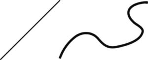
3 varied or univocal, where the varied line enhances the three-dimensionality and gesture, while the unique line, given its regularity, has more two-dimensional and geometric characteristics, in this sense the graphic tools used are particularly important, a soft tool like the brush allows a wide degree of variability due to manual pressure, while a rigid tool, such as the ballpoint pen or pencil, does not allow a significant variation of the line, there are then the nibs, which depending on their hardness or softness, allow different degrees of variation in the thickness of the lines, there are also different degrees of variation of the line thickness of the line, depending on their hardness or softness, allow different degrees of the thickness of the line;
4 The contour line can give shape to figurative or geometric subjects in a varied or univocal way;
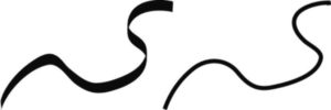
5 the gestural line can be univocal or varied, when it is varied its gestural characteristics are accentuated and in any case has a strong psychological relevance, our eye in following it relives the manual motion that made it by warning violence or serenity, slowness or speed
speedy  jumpy
jumpy 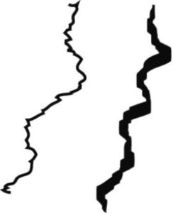
chaotic, tangled and soft 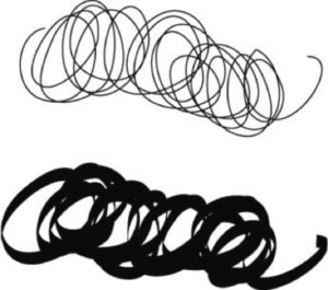
chaotic, violent and acute 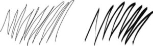
etc;
6 can be decorative, i.e. compose geometric or manual patterns, with unambiguous lines, varied or compound, regular or irregular, etc.;
7 can be kinetic, more commonly used in comics, albeit of futuristic derivation, to give a sense of movement and displacement of an animated or inanimate subject;
8 can finally be handled, i.e. the use of the line in the direction of chiaroscuro;
I would now like to give some examples of the use of the line and I think it is right to do so through some examples taken from comics, where it constitutes the backbone of this language and, within which, it assumes infinite declinations, according to authors and genres.
Any of us, in the course of our lives, has had the opportunity to read a book of Mickey Mouse or has seen the animated version. What are the material sensations that the Disney characters suggest to us? (1)
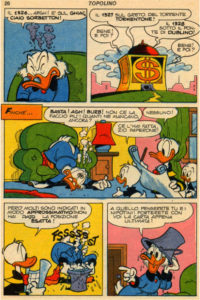 (1)
(1)
Undoubtedly they communicate softness to us, we feel its gumminess (this is confirmed by the high number of students to whom, over the years, I have submitted this question). What is amazing is how this feeling is suggested by a common two-dimensional sheet of paper. What does this illusory feeling of softness suggest in it?
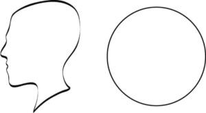
Looking carefully at the structural aspect of the characters, their circular nature is evident, with three circles placed on top of each other: one for the head, a second for the torso and a third for the pelvis. The circle, without the corners, suggests softness, an aspect already discussed in https://www.danilosantinelli.it/danilos-blog/aspects-of-basic-geometric-shapes/.
Let’s deepen the analysis and bring the attention to the contour line. Its appearance is variable, it tends to thicken in some places and to thin out in others. Where the line thickens, it seems closer to our point of view, where it thinns, it seems to move away from it, so that those that previously appeared as circles, thanks to this trivial device, now appear to us as spheres, revealing three-dimensional and soft characters, similar to rubber balls.
Let’s focus now on the second vignette, the one at the top right, where the chest of Uncle Scrooge is depicted. It certainly does not correspond to a traditional building, its convex walls immediately strike our attention, seem to replace the natural hardness of the building with sensations of softness. The simple use of curved elements, once again, has allowed the illusory sensation of softness. This characteristic is also presented by the bucket, the lamp and the piece of furniture on which it rests. Why do objects have this conformation? Building a comic strip means creating a universe that is coherent in itself. If Mickey Mouse’s nature is rubber, so must the universe he lives in. Mickey’s wardrobe can never be the same as that of Superman. Consistency makes a visual text convincing. If some of the elements contained in it contradict each other, the text will not be convincing; if, on the contrary, everything in it corresponds to the same nature, it will appear convincing and involving. It is the insistent coherence of its nature that makes it evident and unequivocal.
We have observed how a line according to the variation of its thickness suggests three-dimensionality, on the contrary a line with the same thickness is perceived as flat. In this sense, the comparison of two tables(2) by Luciano Bottaro (1931-2006) seems appropriate.
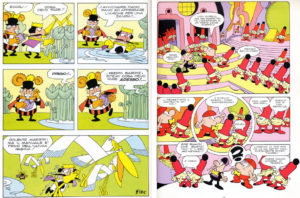 (2)
(2)
In the first case it is a work of an episode of Re di picche, in the second the work is instead taken from Pon Pon. It is evident how Bottaro confronts himself with the creation of two different universes. In Re di Picche he creates a world inhabited by playing cards, a universe where everything is flat like the same cards. The line that draws the king, the objects, the subjects near and far, always has the same thickness, showing us all the elements on the same plane. In Pon Pon, on the other hand, he creates a world dominated by curvilinear forms, three-dimensionality and softness, the characters have a spherical shape. Here too, as in Mickey Mouse, the line with which characters and elements are drawn continuously changes thickness. We are faced with an author who is aware of his own expressive instruments and who, according to the nature of the events he intends to narrate, adopts different elements and codes, suitable for giving coherence and credibility to the representation.
So far we have talked about line as an element of outline, which gives shape to the subject of the drawing, but if we talk about stroke we mean to give a personality to that given movement of pencil or brush (we use the term stroke because we refer to the single movement and gesture made with any drawing tool, where sign indicates any graphic expression, point, line, curve, figure, etc..), when the stroke is transformed into hatching lines should be understood as chiaroscuro elements of the drawing. In this sense we would like to bring the comparison of two comic strips (3), one executed by Sergio Toppi (1932-2012) and the other by Guido Buzzelli (1927-1992). These are two great authors of Italian comics who have made hatching their main expressive tool.
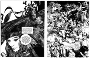 (3)
(3)
In the work on the left, taken from Sherazade and created by Toppi, the structure of the image is elegant and sinuously decorative, the line used by the author does not respond univocally to needs chiaroscuro, but composes textures with an ornamental taste. The image, patiently constructed in its density of lines, imposes a slow reading.
In the work on the right, taken from Zil Zelub by Buzzelli, the composition appears less clean and calm, everything is more chaotic and agitated, the line is fast and nervous, more dirty and hectic.
The compositional structure and traits reveal two distinct personalities with profoundly different narrative needs. Toppi’s universe is dreamy and dreamy, reminiscent of Klimtian and Art Nouveau decorativism and seems to aim at an aesthetic balance aimed at a calm elegance. Sherazade is one of his best works as it is a subject that is well suited to the trait and structure that are typical of him. The narration in Zil Zelub (anagram of Buzzelli) by Guido Buzzelli also shows dreamlike aspects, but with notes of surreal nightmare. The subtitle of the volume is in fact The Man Who Lost the Pieces, the protagonist at the end of each psychoanalytic session leaves with pieces of his body under his arm, a leg, his head and so on. In short, the frenetic neurosis of the line and the composition coincide with the narrated subject. Also in this case Zil Zelub is probably the most successful and well-known work of the author.
The line always implies a gesture, the movement made by the hand. This gesture can therefore suggest calm, slowness, nervousness, speed, violence and so on. When the line increases in size, this gesture can engage the whole arm or even the body, an aspect certainly more present in painting, both for the generally larger formats and for the greater expressive use of color and brush. In painting, therefore, the gesture tends to be more evident and prone to change into mass and matter (4). The softness of the brush, particularly when large, tends to transform the sign into mass and, the presence of the pictorial mixture, to highlight its material aspect.
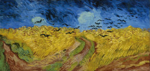 (4)
(4)
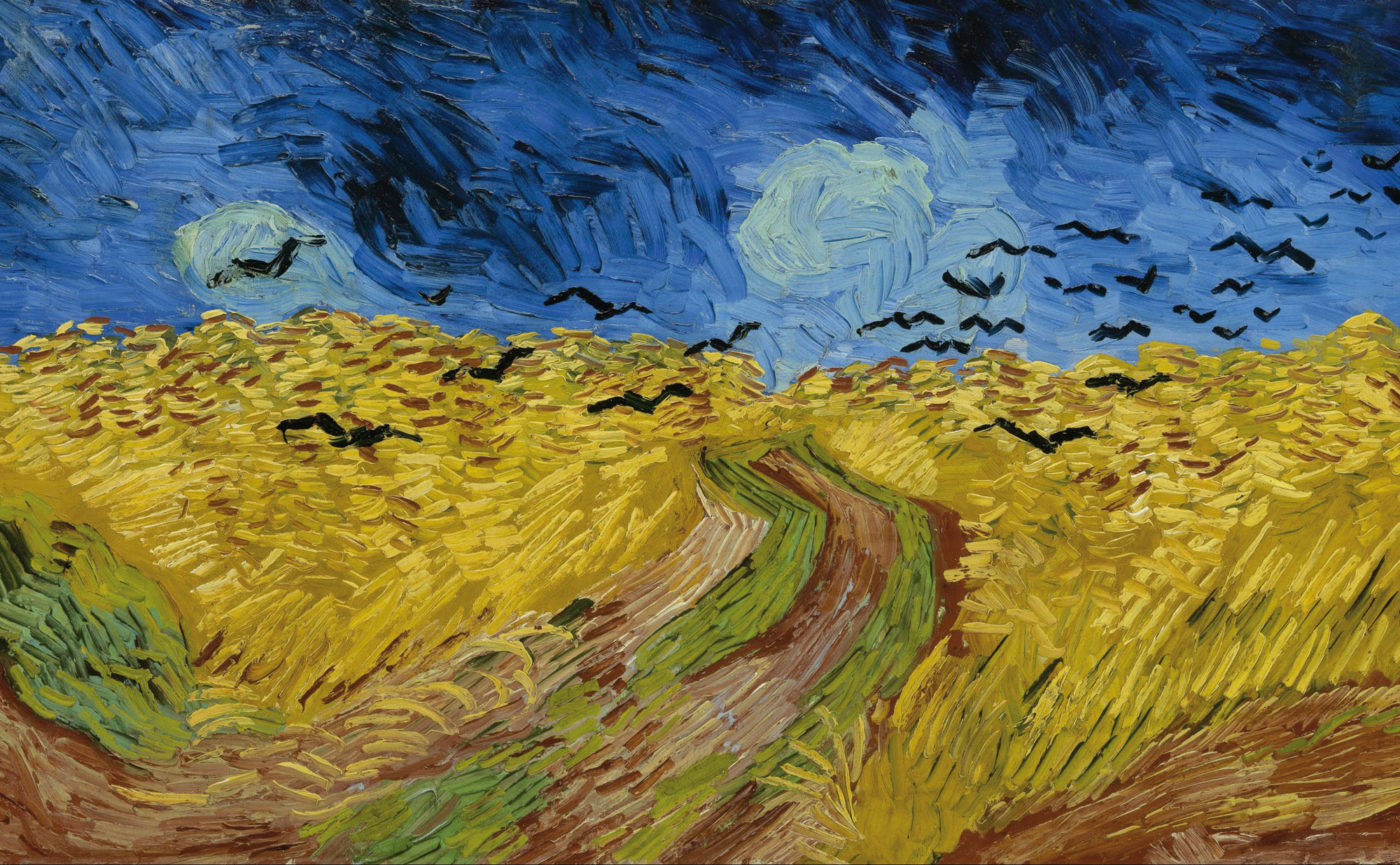
In Wheat field with crows flying by Vincent van Gogh in 1890 (the year of his death) this aspect becomes evident, the whole painting shows the swirling traces of the pictorial gestures obtained with a spatula. Everything in it is crude and clumsy, the drawing is sacrificed to the advantage of gestural and material expression. All the elements of the painting, sky, crows, wheat, are animated by the same frenetic energy. Those who know the production of the Dutch painter know that this energy is a distinctive feature, it increases from work to work until it becomes explosive with the approach of suicide, expressive evidence of the exacerbation of neurosis.
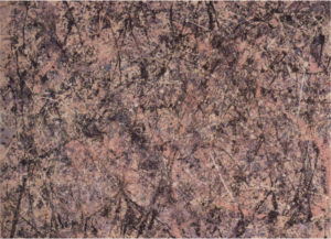
Painting is essentially a matter expression. This aspect is perfectly embodied by the examples produced by the Informal current or Abstract Expressionism (artistic currents that began after the Second World War that renounced figuration in order to use a suffered material, the embodiment of the pain and devastation brought by the war). In it the expression and the narrative representation are only assigned to the colour, to the matter and to the gesture, without figuration or even composition. In many cases the chromatic mass covers the entire surface of the canvas, as in the work of one of its most famous protagonists, Jackson Pollock (1912-1956). For many years, in the course of my visual perception lessons, I have been presenting this image(5) without providing either the author’s identity or any other indications, but simply asking the students for their immediate emotional reaction in viewing it. Everyone feels confusion, nervousness, anguish, restlessness. For those who do not know Pollock’s work and story, learning how his state of alcoholism and depression is clearly manifested in his painting, devoid of figurative elements, always arouses a certain astonishment. This testifies to how pictorial matter is totally self-sufficient on the expressive level.
 (5)
(5)
The canvas is scattered with traces and splashes of colour, which Pollock obtained by dripping the paints directly onto the surface. The marks become tangled and in some cases look like violent splashes, stains or drips. The painter throws the colour onto the canvas, placed horizontally, using a dry brush or a stick. The combination of stains, splashes and swirls of color that tangled in each other create a mental vertigo in the viewer. The same mental vertigo that the author had to live in. In the extreme case of Pollock’s Action Painting, the use of the body is exemplary, the canvases are of considerable size and he is forced to move from one point to another, adopting a painting made up of action and dynamism that give it an almost ritual aspect, seeming to lead us back to rock painting, of which his canvases bear traces.
Bibliography
AA.VV., Desideri in fiorma di nuvole. Cinema e fumetto, Paisan di Prato (UD), Campanotto Editore, 1996.
AA.VV., Gulp! 100 anni a fumetti, Milano, Electa, 1996.
AA.VV., Nuovo fumetto italiano, Milano, Fabbri Editori, 1991.
ARNHEIM Rudolf, Arte e percezione visiva, [1954], Milano, Feltrinelli, 2002.
BAIRATI Eleonora FINOCCHI Anna, Arte in Italia, [1984], Torino, Loescher, 1991.
BARBIERI Daniele, I linguaggi del fumetto, Milano, Bompiani, 1991.
BARONI Daniele, Il manuale del design grafico, [1999], Milano, Longanesi & C., 2006.
BOSCHI Luca, Frigo valvole e balloons. Viaggio in vent’anni di fumetto italiano d’autore, Roma-Napoli, Edizioni Theoria, 1997.
BRANCATO Sergio, Fumetti. Guida ai comics nel sistema dei media, Roma, Datanews Editrice, 1994.
CHEVALIER Alain GHEERBRANT Alain, Dizionario dei simboli, [1969], Milano, Rizzoli, 2006.
DE GRANDIS Luigina, Teoria e uso del colore, Milano, Arnoldo Mondadori Editore, 1984
DE VECCHI Pierluigi CERCHIARI Elda, Arte nel tempo, [1991], Milano, Bompiani, 1996.
FAVARI Pietro, Le nuvole parlanti. Un secolo di fumetti tra arte e mass media, Bari, Edizioni Dedalo, 1996.
FRESNAULT-DERUELLE Pierre, I fumetti: libri a strisce, [1977], Palermo, Sellerio Editore, 1990.
FREZZA Gino, La scrittura malinconica. Sceneggiatura e serialità nel fumetto italiano, Firenze, La Nuova Italia, 1987.
GOMBRICH, Ernst H. HOCHBERG Julian BLACK Max, Arte percezione e realtà, [1972], Torino, Einaudi, 2002.
ITTEN Jhoannes, Arte del colore, [1961], Milano, Il Saggiatore, 2001.
KANDINSKY Wassily, Punto linea superficie, [1925], Milano, Adelphi, 1982
MALTESE Corrado, Guida allo studio della storia dell’arte, [1975], Milano, Mursia, 1988.
PELLITTERI Marco, Sense of comics, Roma, Castelvecchi, 1998.
RAFFAELI Luca, Il fumetto, Milano, il Saggiatore, 1997.
REY Alain, Spettri di carta, [1982], Napoli, Liguori, 1988.
RICCIARDI Enrica, Il cuore delle nuvole. Arte figurativa e fumetto, Paisan di Prato (UD), Campanotto Editore, 1996.
SWEENEY Michael S., Dentro la Mente – La sorprendente scienza che spiega come vediamo, cosa pensiamo e chi siamo,, Vercelli, Edizioni White Star (per l’Italia), National Geographic Society, 2012
TORNAGHI Elena, Il linguaggio dell’arte, [1996], Torino, Loescher, 2001
Siti web